
Hi, I'm Alexandr Kuznetsov, Senior Product Designer specializing in growth, monetization, and high-traffic consumer platforms.
Impact from product experiments and UX redesigns across high-traffic user flows.
I design product experiences that turn high user traffic into measurable business outcomes.
My work focuses on growth and monetization flows — onboarding, pricing, subscriptions, and payment UX — using experimentation and behavioral insights to improve conversion.
I collaborate closely with product managers and engineers to test hypotheses, redesign critical user journeys, and scale solutions through design systems.
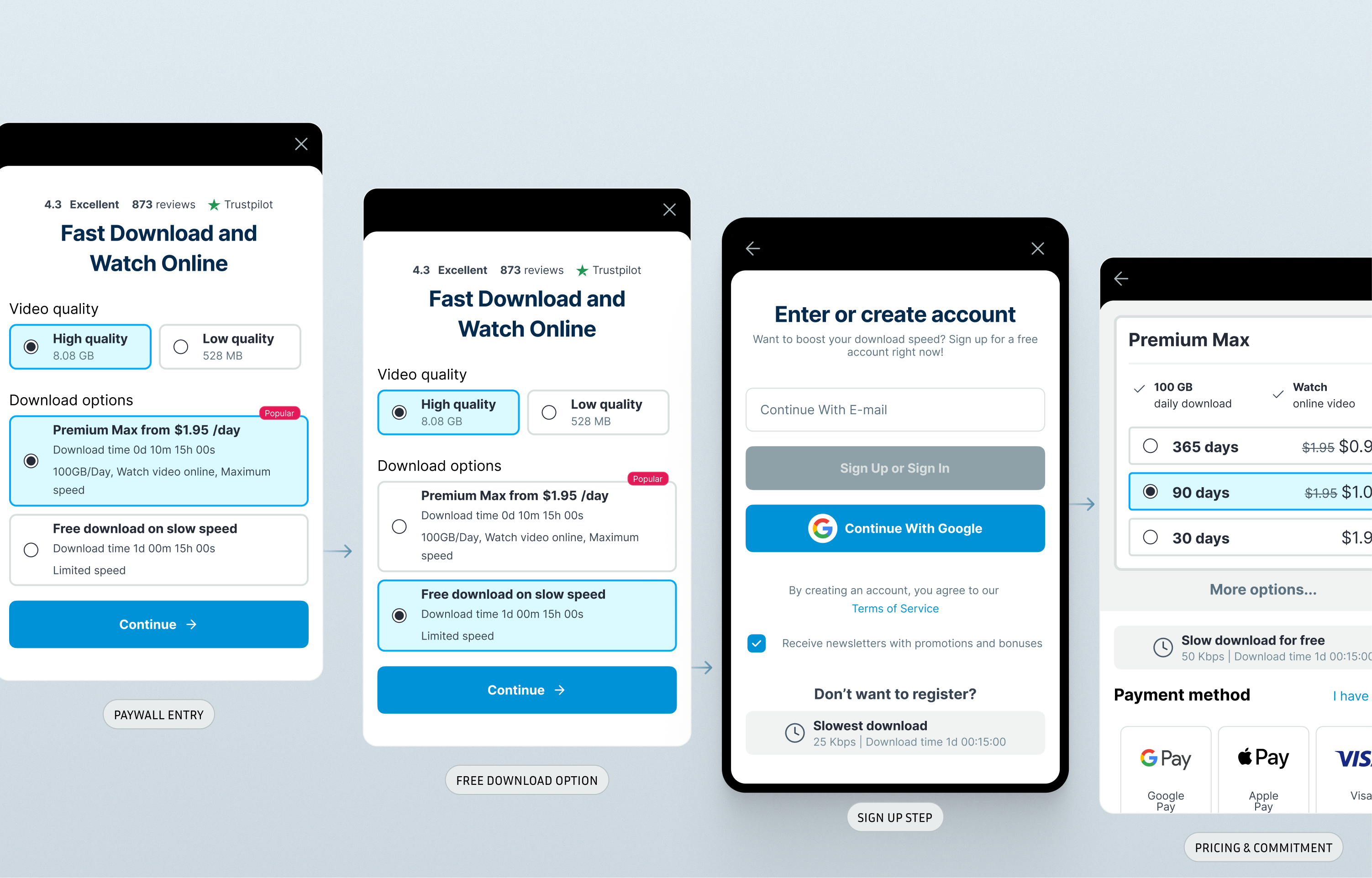
File Download Page+51% New User Registrations
Redesign of the highest-traffic screen in the product. The original page functioned only as a waiting screen before downloads started. The redesign used this waiting time to communicate product value and introduce a clear registration path. Result: new user registrations increased by 51%, generating +$25k monthly recurring revenue.
Global freemium file-sharing platform focused on video content. The product receives high traffic from users worldwide. Most visitors arrive via shared links or search engines and land directly on file pages. The business model combines free downloads with limited speed or functionality and paid subscriptions unlocking faster downloads and additional features. Because files are often shared externally, many visitors interact with the product without prior knowledge of the platform. Video content represents a large portion of traffic, which strongly influences expectations around preview, playback, and download speed.
Legacy interface patterns and technical limitations; different desktop and mobile layouts requiring adapted solutions; limited development resources (high impact, minimal implementation complexity); established user habits requiring preservation of familiar interaction patterns.
Despite being the highest-traffic screen in the product, the download page converted very few visitors into registered users. The interface focused exclusively on the technical download process and did not communicate the value of creating an account. Mobile users often saw only a countdown timer and a download button with no clear reason to register.
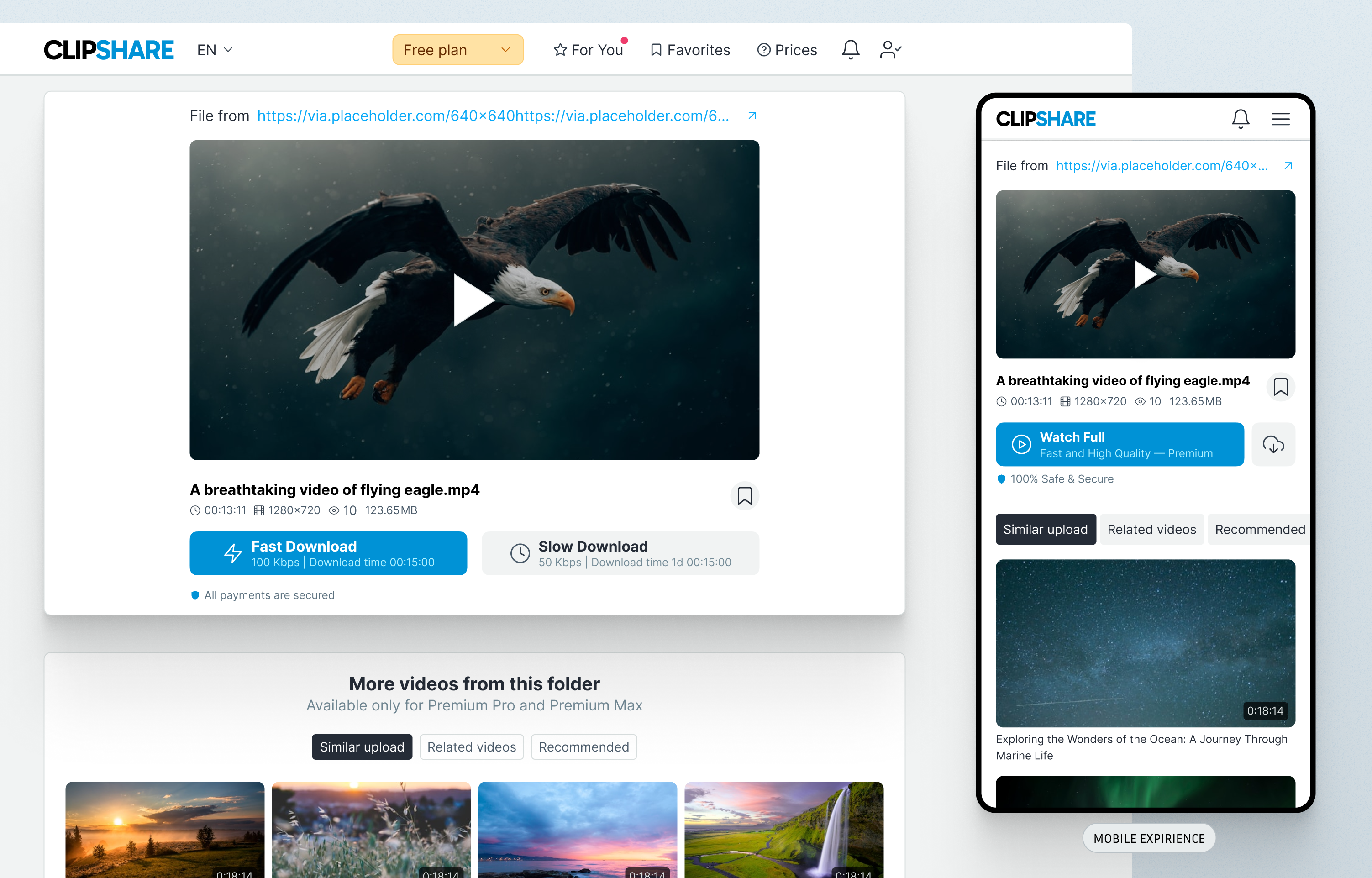
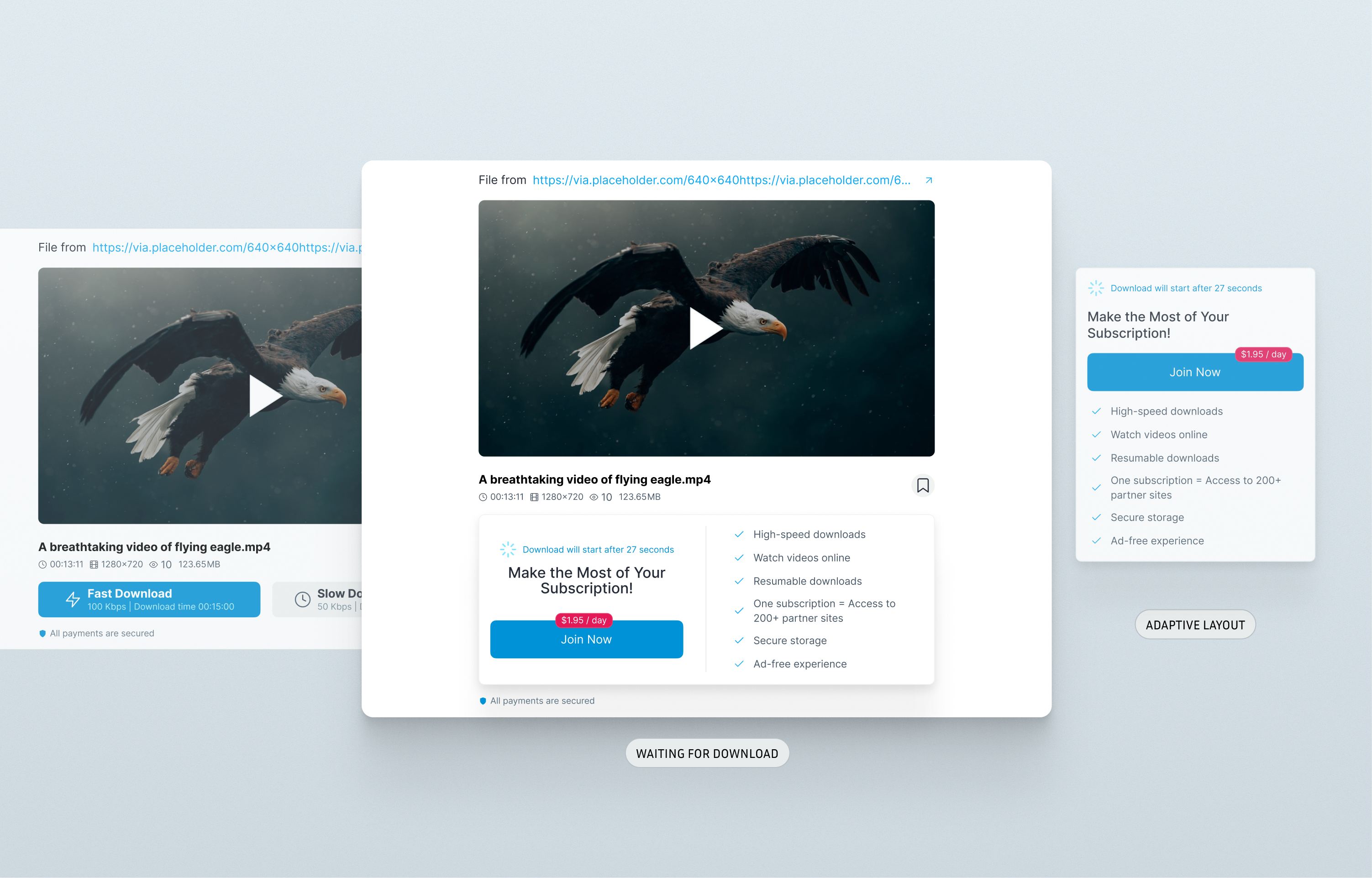
Users spend several seconds waiting before downloads begin. This waiting period represents a moment of high attention. If product value is communicated during this time and registration is clearly visible, more users may create accounts before downloading.
High-traffic utility pages can become powerful acquisition surfaces when product value is communicated clearly.
Design decisions
Use waiting time as communication space
The interface introduces short benefit messages explaining advantages of creating an account.
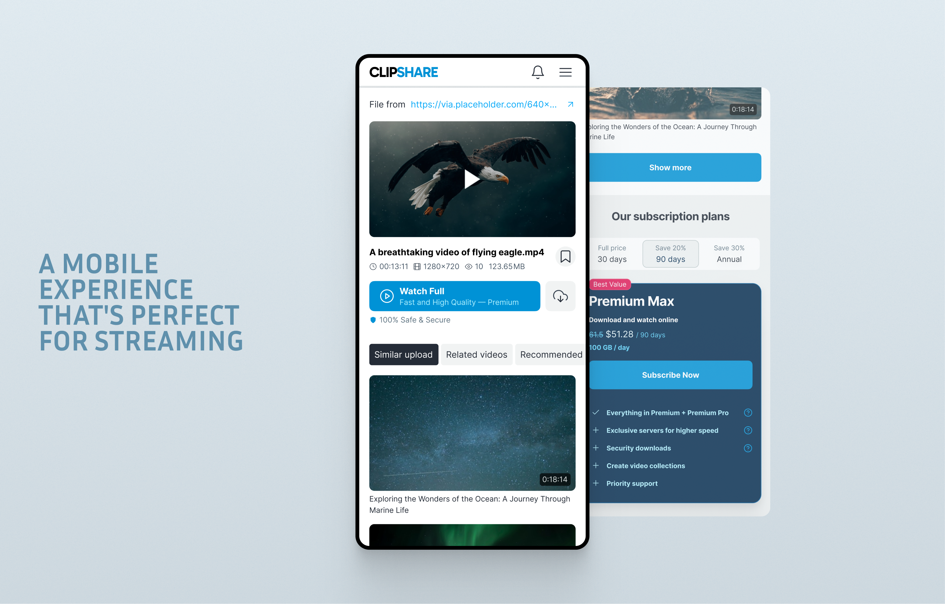
Mobile-first layout
Key elements are visible within the first viewport on mobile devices.
Scannable information blocks
Messages are structured into short blocks to support quick reading during the countdown.
Result. The redesign transformed a purely technical page into a product entry point. More visitors registered before downloading, increasing the number of users entering the paid funnel.
Additional screens
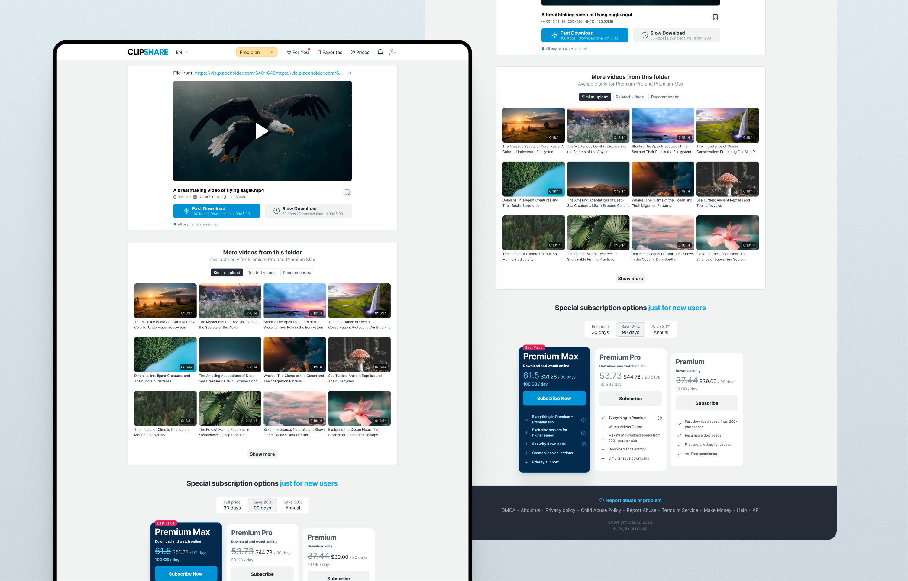
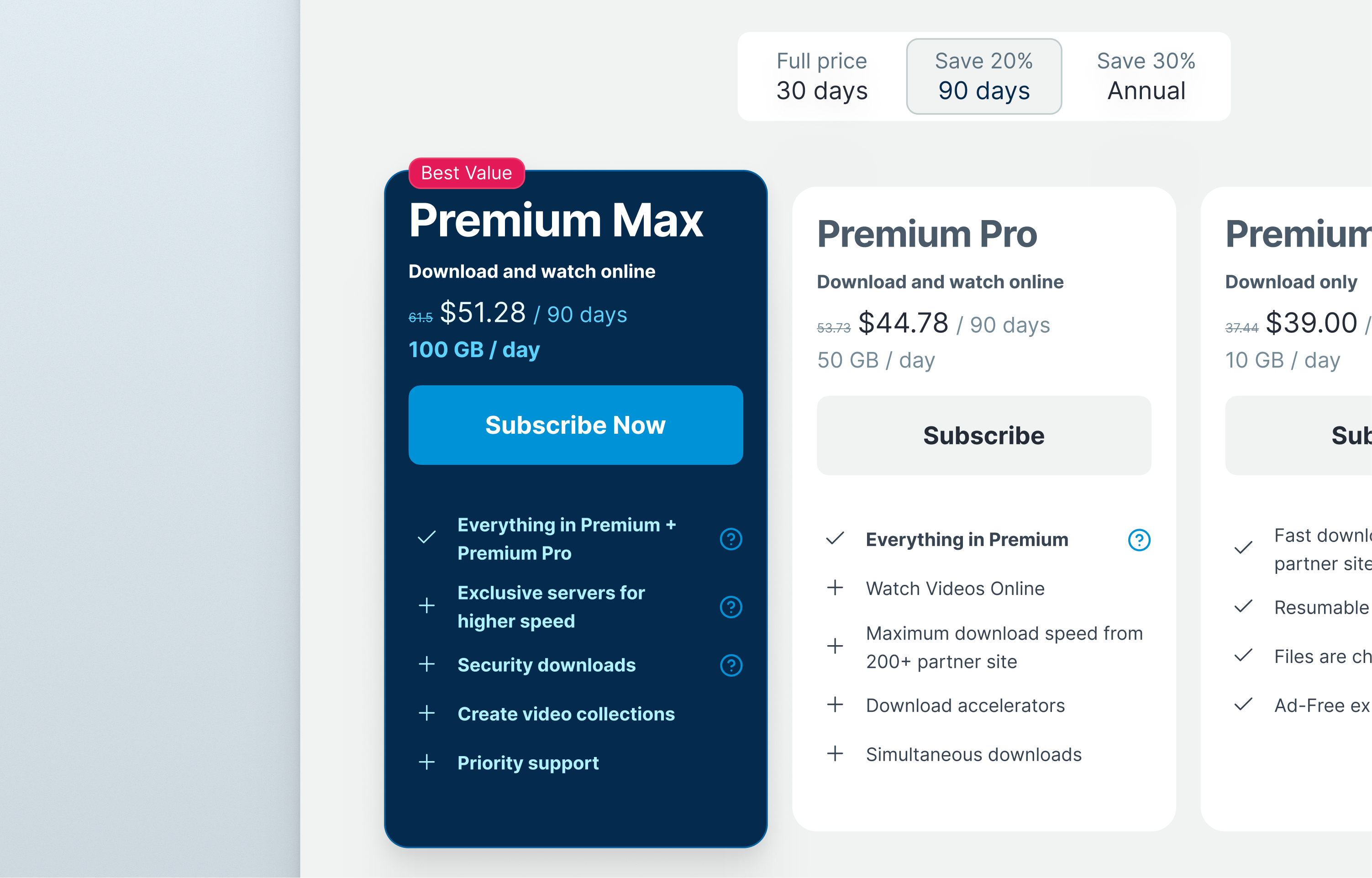
Pricing PageRepeat Purchase Conversion +11%
Visual redesign of the pricing page improved clarity and trust in premium plans. Without changing pricing or backend logic, the new layout increased repeat purchases.
Freemium file-sharing platform offering multiple subscription tiers. Many users return to the pricing page to renew or upgrade subscriptions.
Legacy layout limited structural changes. Pricing logic and billing infrastructure were fixed. Engineering capacity required low-complexity design solutions. Long-term users were familiar with existing pricing presentation.
Returning users often selected lower-value plans or postponed renewing subscriptions. The pricing interface did not clearly communicate the value difference between plans.
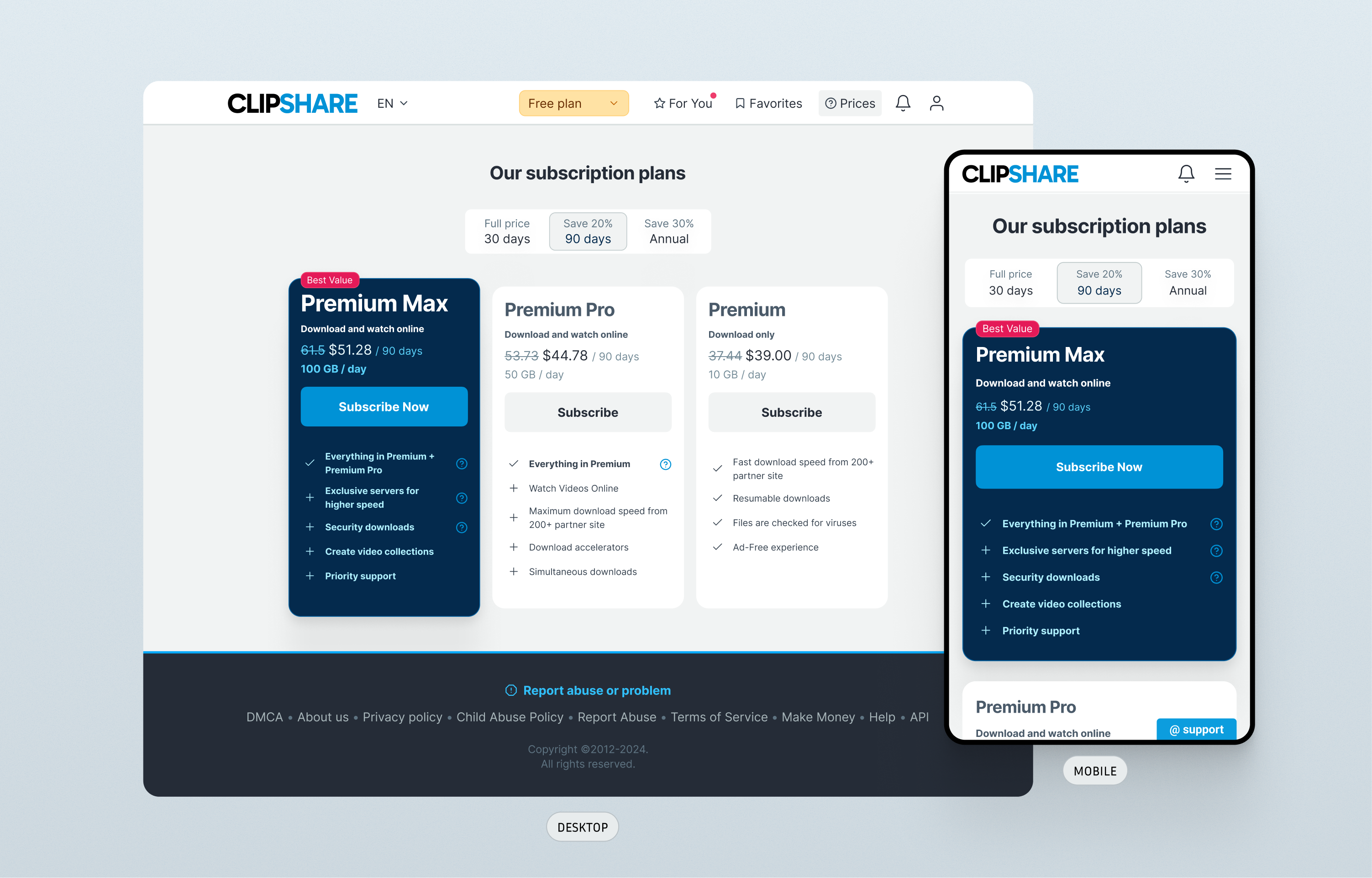
Improving visual hierarchy and emphasizing the recommended plan may help returning users better understand its benefits.
Clear visual hierarchy strongly influences subscription decisions.
Design decisions
Highlight recommended plan
The premium plan receives stronger visual emphasis.
Improve readability
Typography and spacing simplify comparison.
Clarify value differences
Key features are highlighted to help users understand benefits.
Result. The redesigned pricing page improved plan comprehension and increased repeat purchase conversion.
Payment FlowSimplifying Plan Selection
The original checkout presented too many pricing combinations simultaneously. A redesigned flow simplified the decision process through progressive disclosure. Result: +14% revenue.
Freemium file-sharing platform offering subscription plans for faster downloads and premium features. Users choose subscription plans during checkout when upgrading from the free tier.
Legacy checkout architecture limited structural changes. Pricing logic and billing infrastructure could not be modified significantly. Engineering resources were limited, requiring minimal-complexity UI changes. Existing users were accustomed to the previous checkout layout.
The checkout screen displayed up to nine pricing combinations simultaneously. This created decision fatigue and made it difficult for users to quickly identify the best option. Many users abandoned the purchase process at this stage.
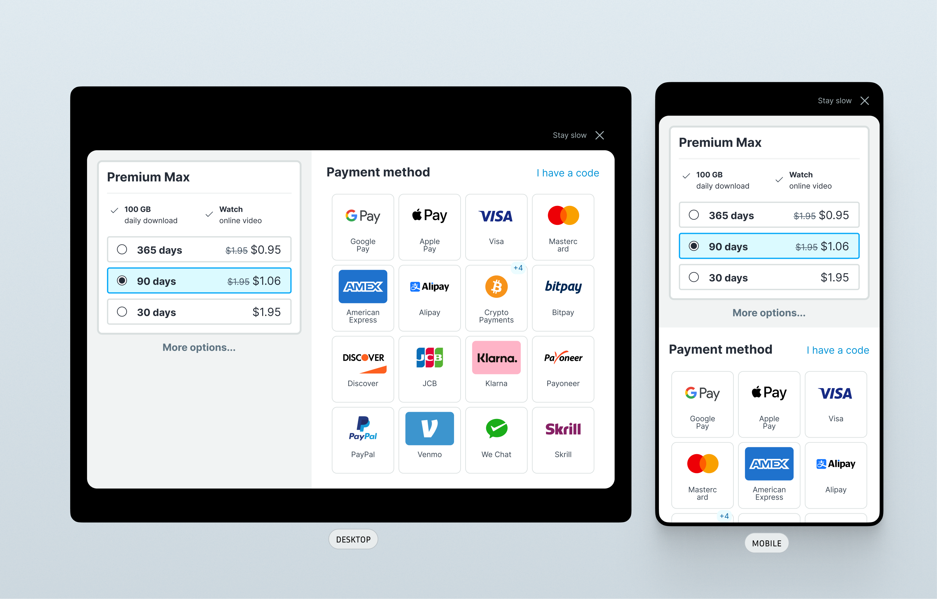
Reducing the number of visible options and presenting choices step-by-step may simplify decision making and improve purchase completion.
In pricing interfaces, simplifying visible choices can significantly improve conversion.
Design decisions
Reduce visible options
Only three primary plans are visible initially.
Progressive disclosure
Additional choices appear only after a plan is selected.
Clear visual hierarchy
Pricing information is structured to guide user decisions.
Result. The redesigned checkout reduced cognitive load and improved purchase completion rates.
Mobile Download FlowFirst Purchase Conversion 9%
Redesign of the mobile free-download flow. Strategic interaction steps were introduced before downloads began to expose users to subscription benefits. Result: first purchase conversion 9%, generating +14% revenue.
Global freemium file-sharing platform focused on video content with high worldwide traffic. Most mobile users arrive through external links and start interacting with the product through download flows. The platform monetizes through subscriptions that provide faster downloads and additional features.
Legacy architecture limited the ability to redesign the entire download system. Mobile and desktop versions historically used different flows. Engineering resources were limited, so solutions needed to prioritize high impact with minimal development effort. Many users were long-time users familiar with existing download mechanics.
The original mobile download flow minimized interaction to start downloads as quickly as possible. While this improved speed, it almost completely removed exposure to premium features and subscription benefits. As a result, very few users made their first purchase.
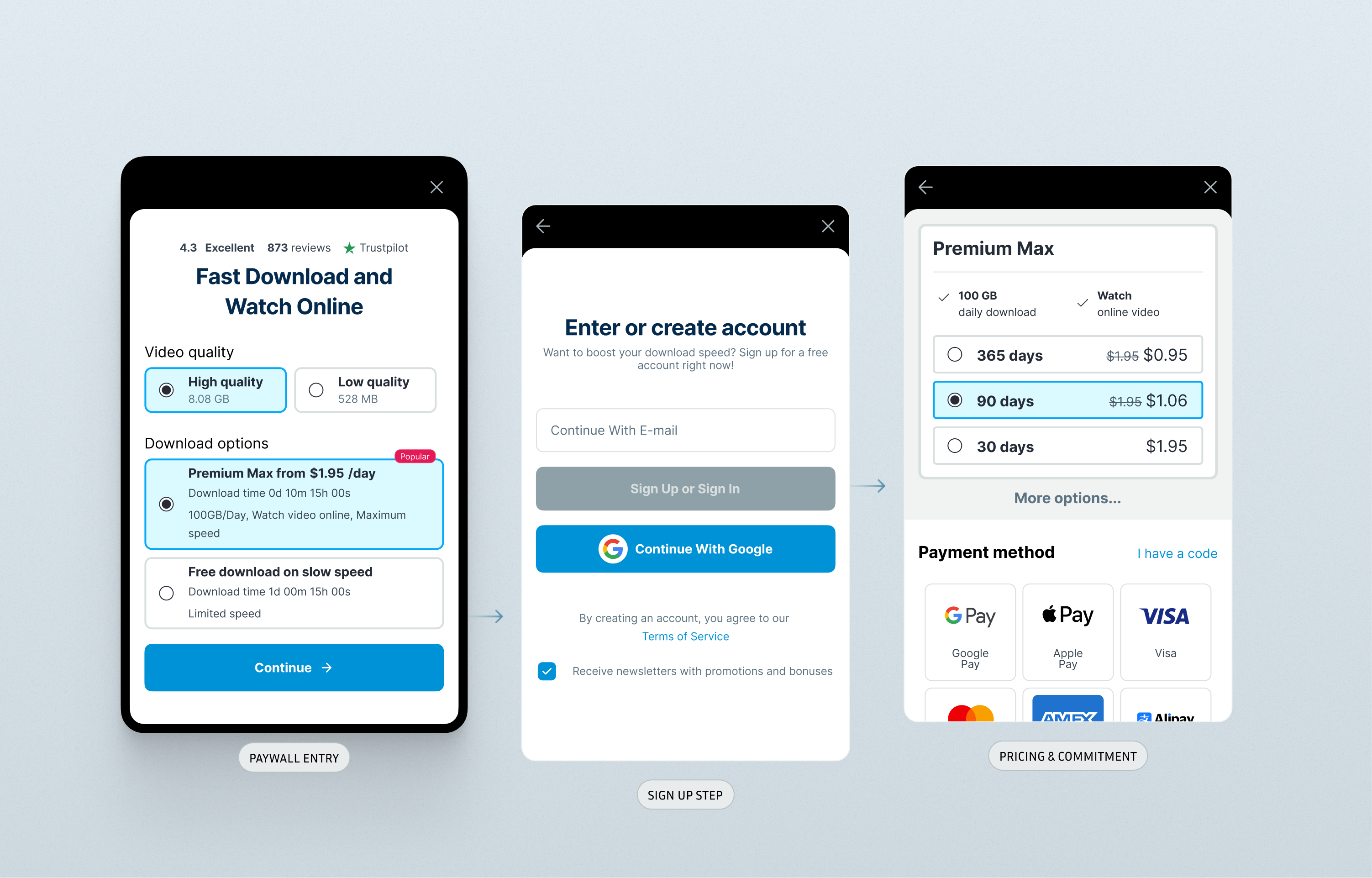
Free downloads attract high traffic but expose users to very little product value. Introducing small interaction steps before downloads begin may increase visibility of premium benefits and encourage upgrades.
In freemium systems, carefully placed interaction steps can improve monetization without harming core functionality.
Design decisions
Introduce strategic friction
Additional interaction steps create opportunities to communicate premium value.
Expose subscription benefits
Screens highlight advantages of paid plans before downloads begin.
Maintain perceived progress
The flow communicates that the download process continues even with additional steps.
Result. The revised flow increased exposure to premium features and significantly improved first purchase conversion.